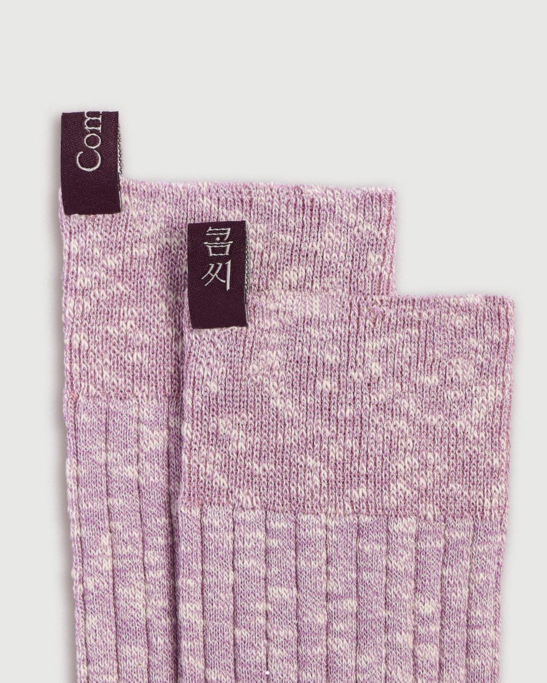

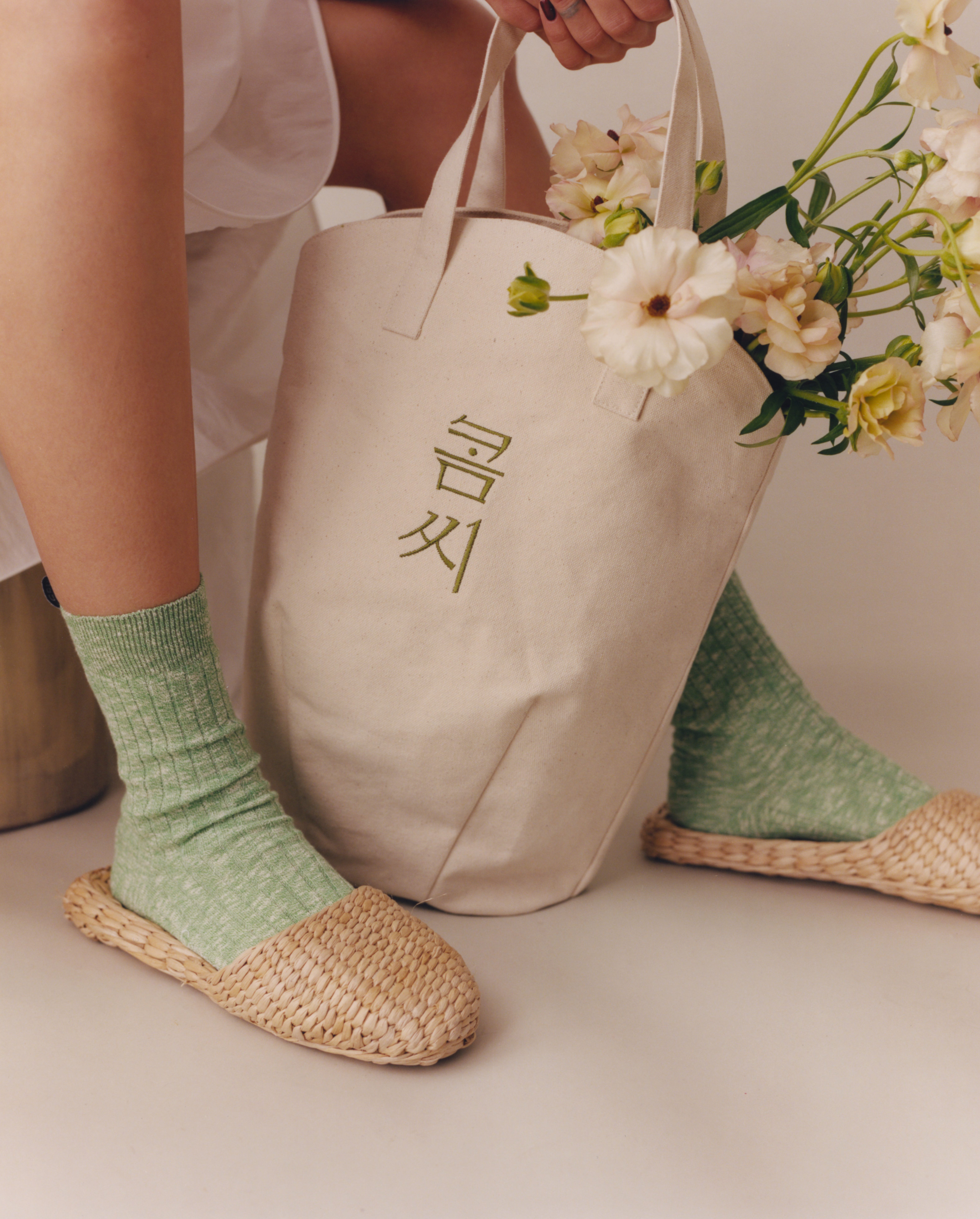


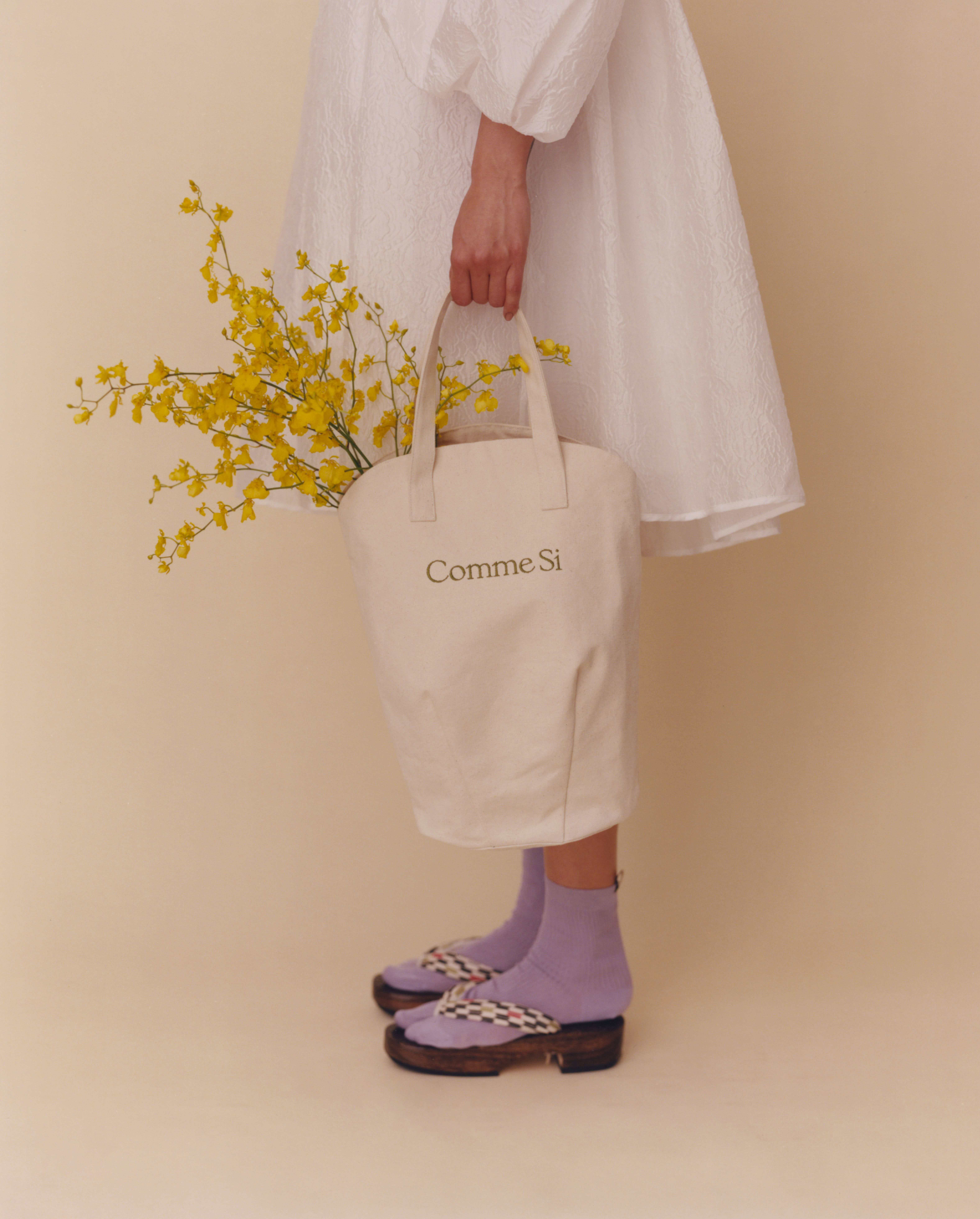
Comme Si (콤씨) — Brand Identity, 2021
Commissioned for a Korean interpretation of the Comme Si wordmark. Custom hangul lettering was created using elements & letter structures from the original mark.
︎ commesi
Photography: Peter Ash Lee
Styling: Herin Cho
Creative Direction: Jenni Lee
Creative Producer: Ashley Tong
︎ commesi
Photography: Peter Ash Lee
Styling: Herin Cho
Creative Direction: Jenni Lee
Creative Producer: Ashley Tong

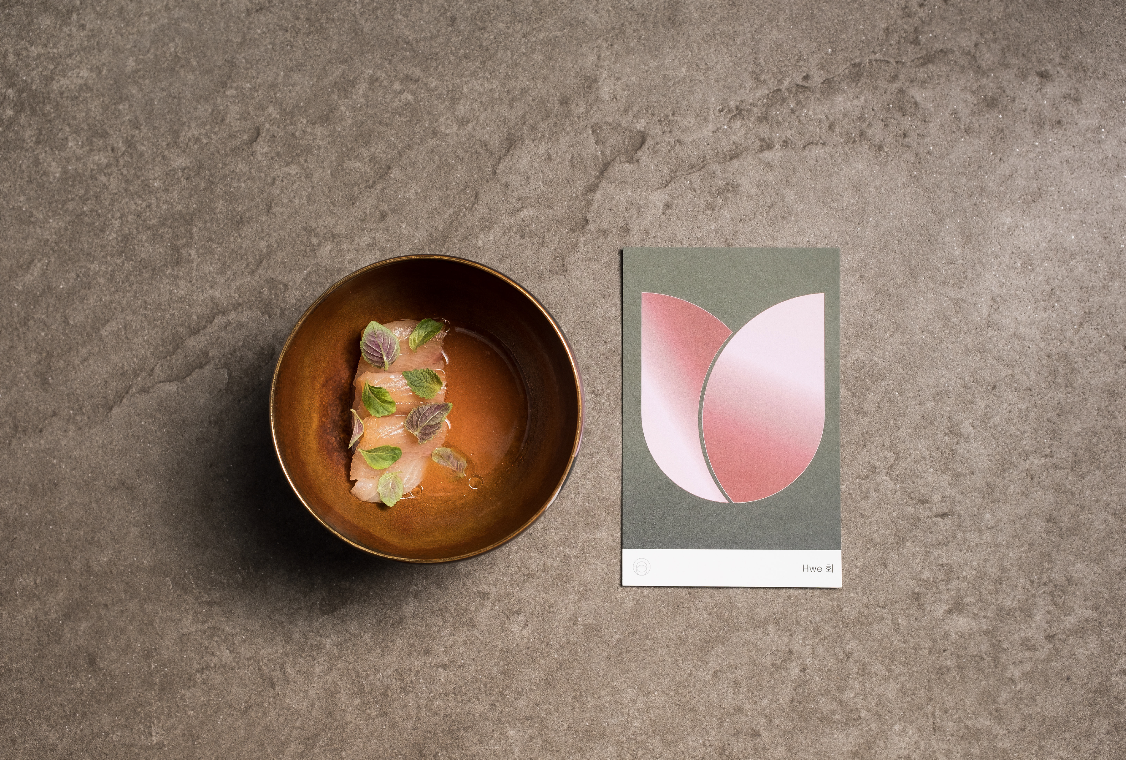
Atomix — Menu Card 90 x 140mm, 2019
Atomix is a 10-course tasting menu restaurant in New York City, recently awarded 2 Michelin star and NYTimes critic 3-stars for its innovative/modern Korean cuisine.
Each guest is presented a card that represents the dish along with a list of ingredients and a short essay from the chef. I was fornature enough to illustrate and create 10 cards for the ‘18/’19 Winter season.
90 x 140mm, Typefaces, Monument Grotesk, Gothic A1, 100% recycled, 130, Printer, Smartpress
Photography by Diane Sooyeon Kang
︎ atomixnyc

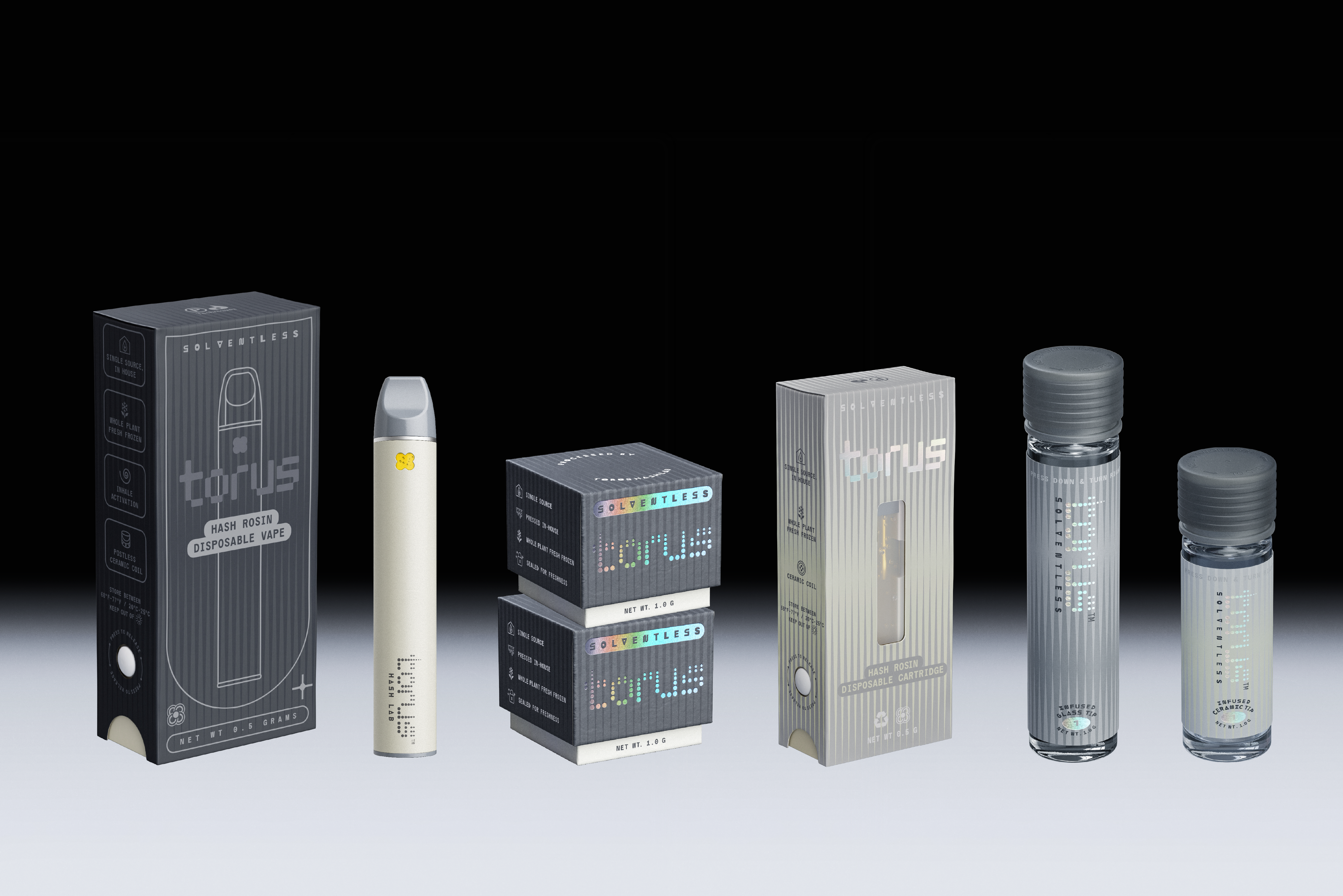
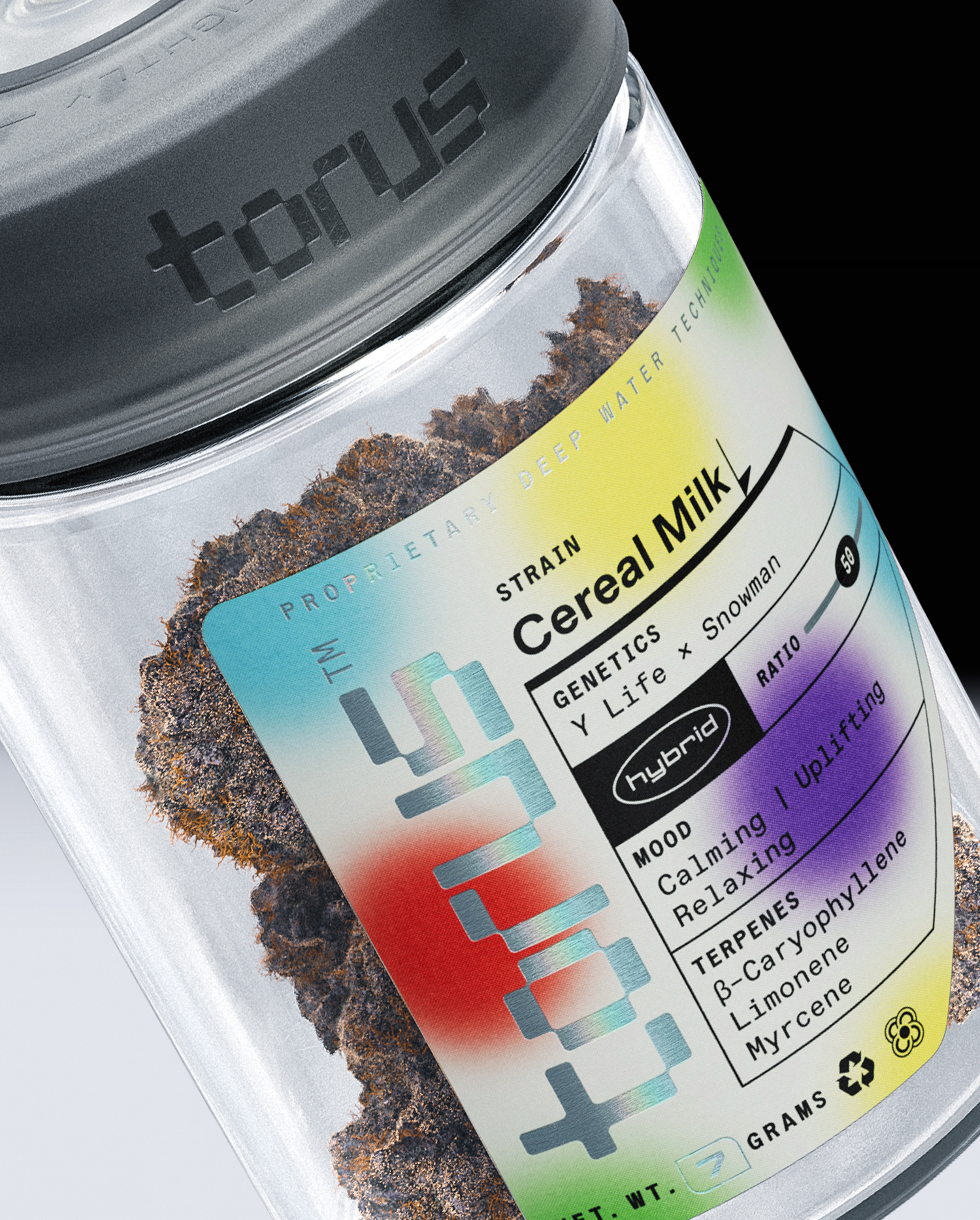
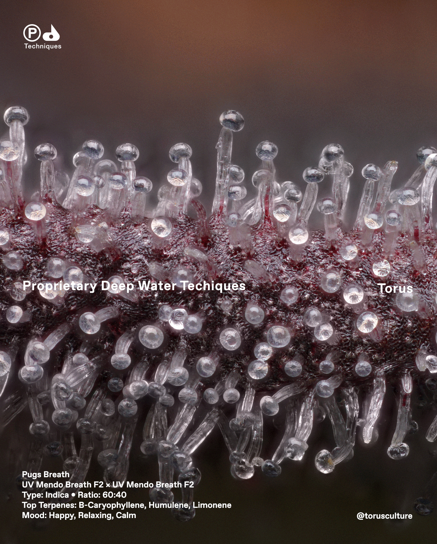
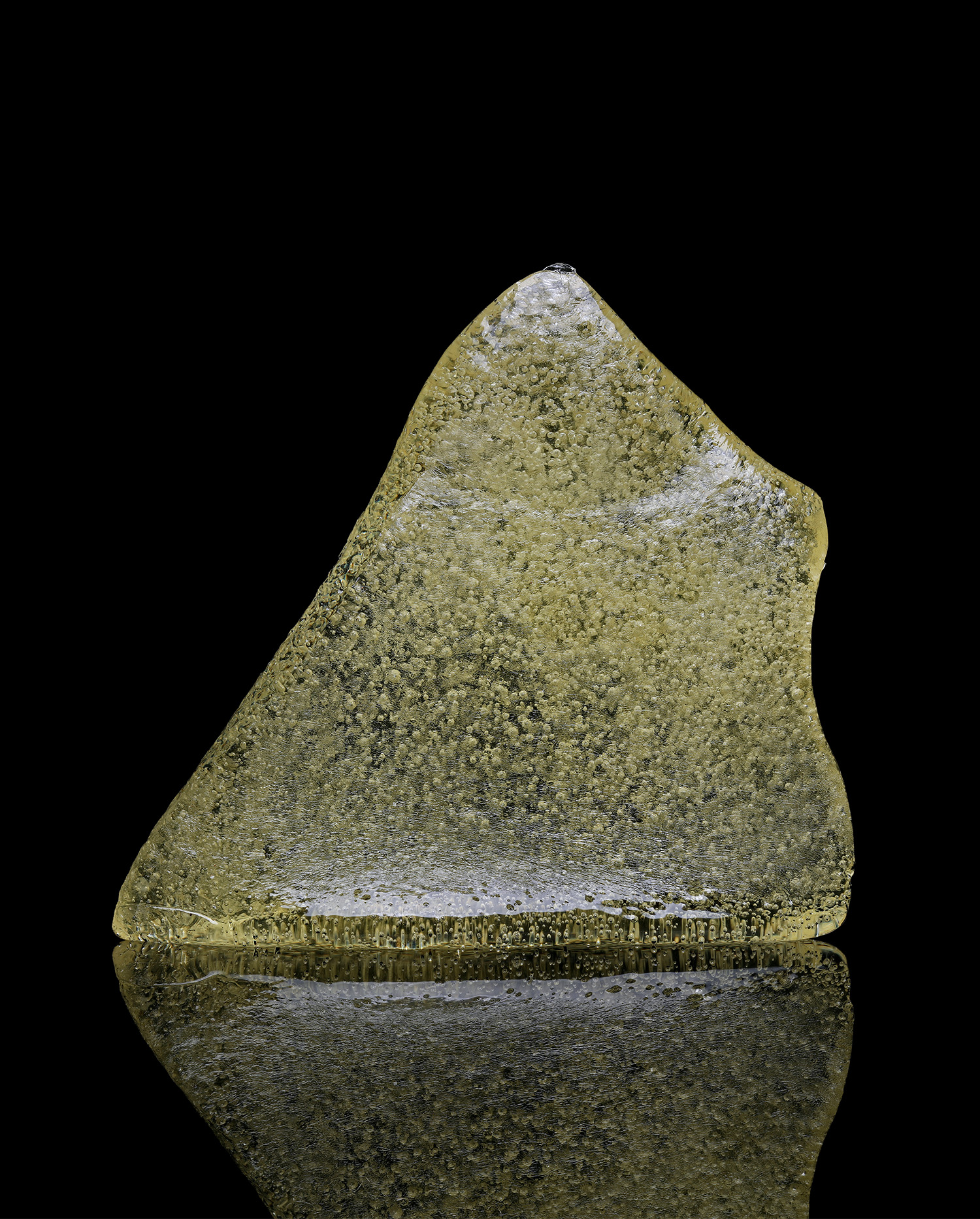
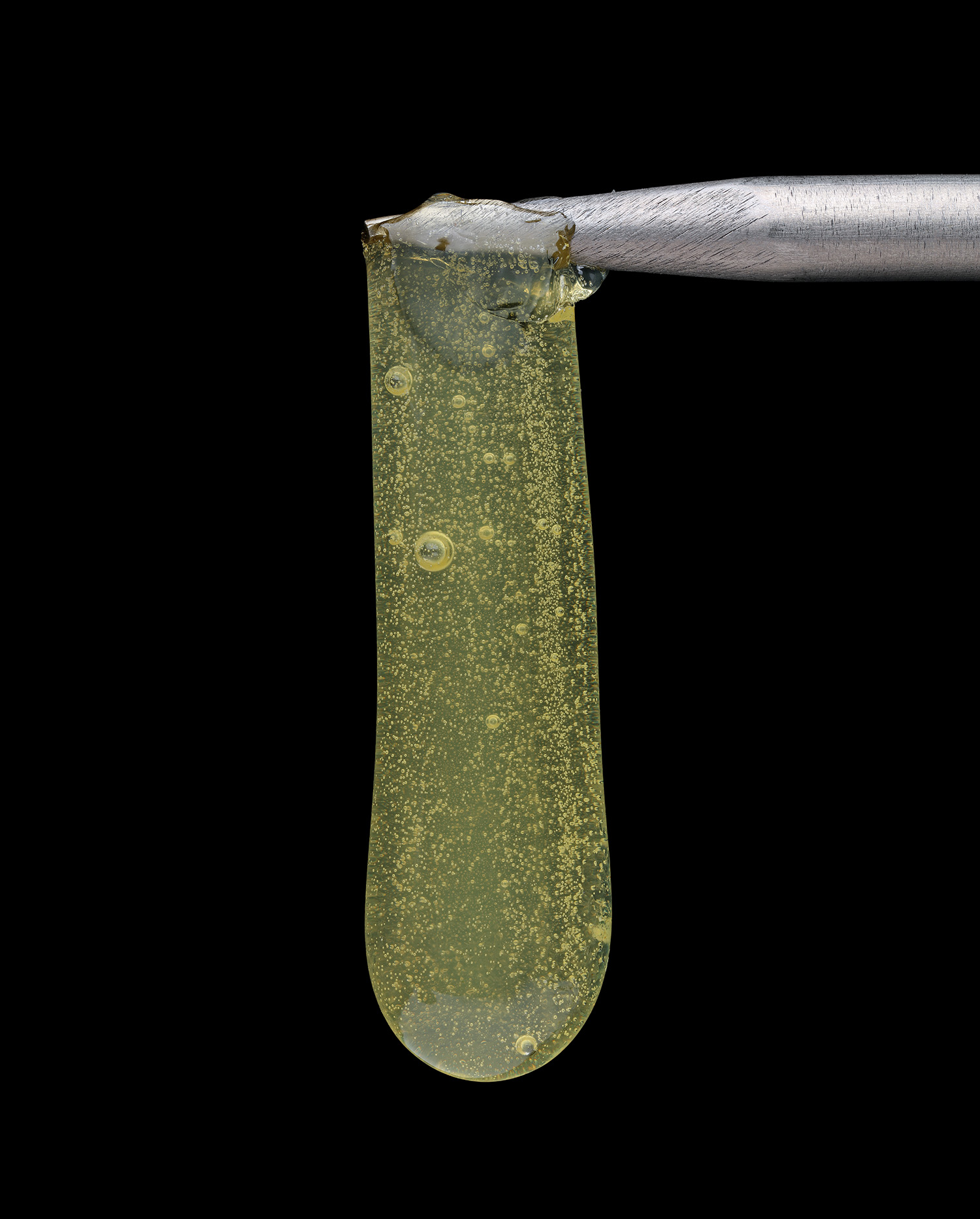
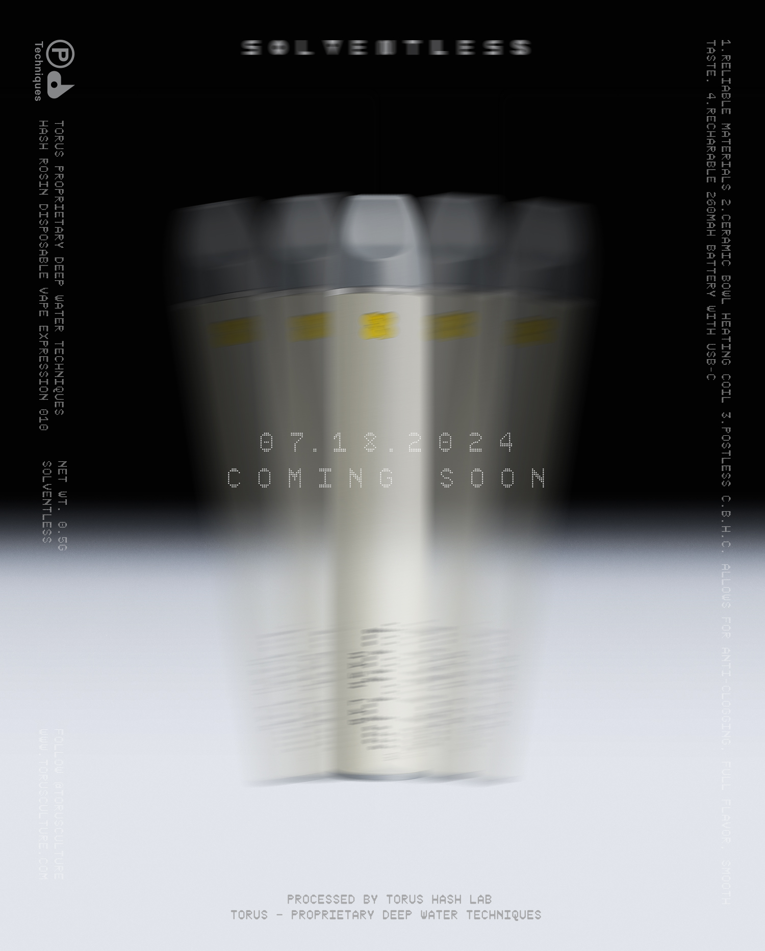

Torus – Brand Identity + Packaging + Web Design , 2020 – present

Torus is a hydroponically grown cannabis company based in Seattle, committed to delivering high-quality products. The founders initially sought out to my expertise to develop a strong brand identity and packaging system.
I’ve collaborated with a team of product designers to develop a custom vacuum-seal vessel. Given the perishable nature of the product, our objective was to create a solution that would preserve freshness throughout the product's journey to the consumer. Ensuring optimal freshness through thoughtful packaging has always been a key element of our brand's identity.
As the lead creative for the company, I have been consistently building the brand’s affinity and equity, helping Torus establish a strong presence in the Washington cannabis market.
︎ torusculture
CGI Artist – Emmery Macsay
Photography – Erik Christiansen


Atoboy — Brand Refresh & Printed Matter, 2020
Atoboy opened its doors in July 2016, drawing inspiration from the concept of banchan—small side dishes that accompany every Korean meal. Since then, it has gained recognition from The New York Times, the Michelin Guide, and OAD, among other global dining destinations. I was brought on to refresh the brand’s wordmark and enhance the overall menu experience – including printed collateral, merch, take-away items, stickers.
︎ atoboynyc
︎ atoboynyc
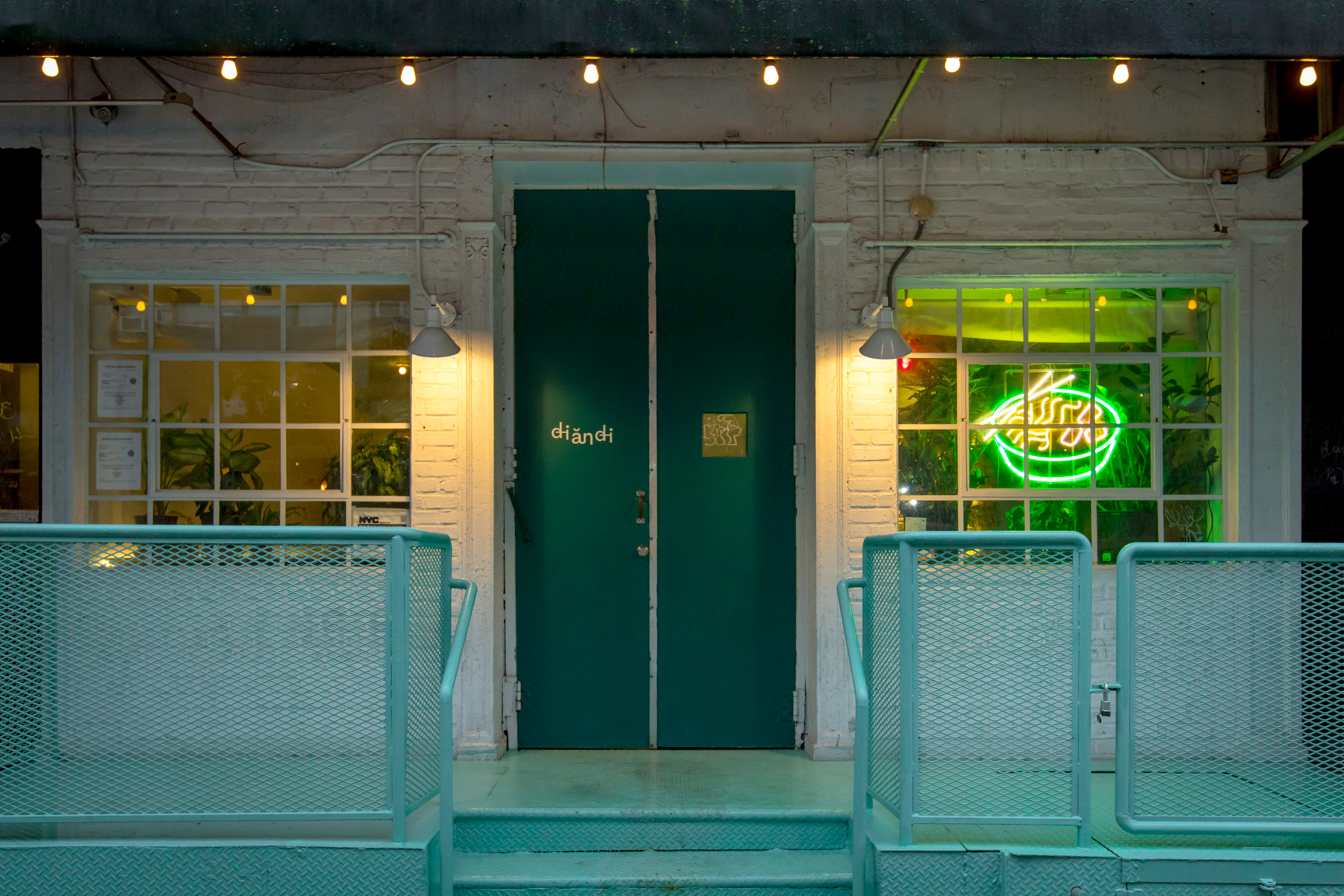
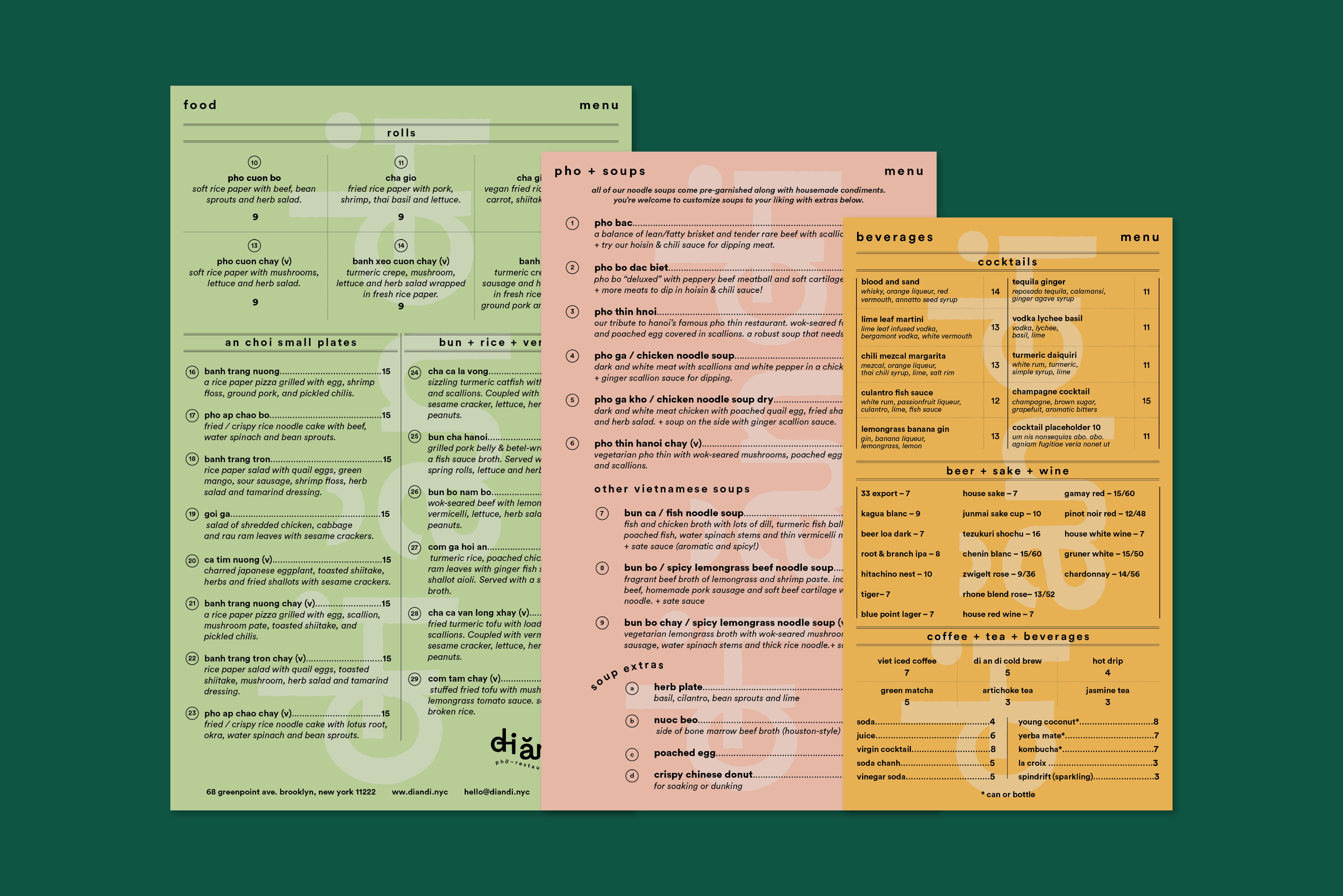
Di An Di — Brand Identity & Printed Matter + Illustration, 2018
Brand identity and illustratons for Vietnamese restaurant in Greenpoint, Brooklyn. Di An Di is an endearing phrase in Vietnamese that translates “Let’s go eat!”
Designed all of the customer touch points from menu, business cards, coasters, stickers and printed promotional pieces.
︎ diandi.nyc
Designed all of the customer touch points from menu, business cards, coasters, stickers and printed promotional pieces.
︎ diandi.nyc


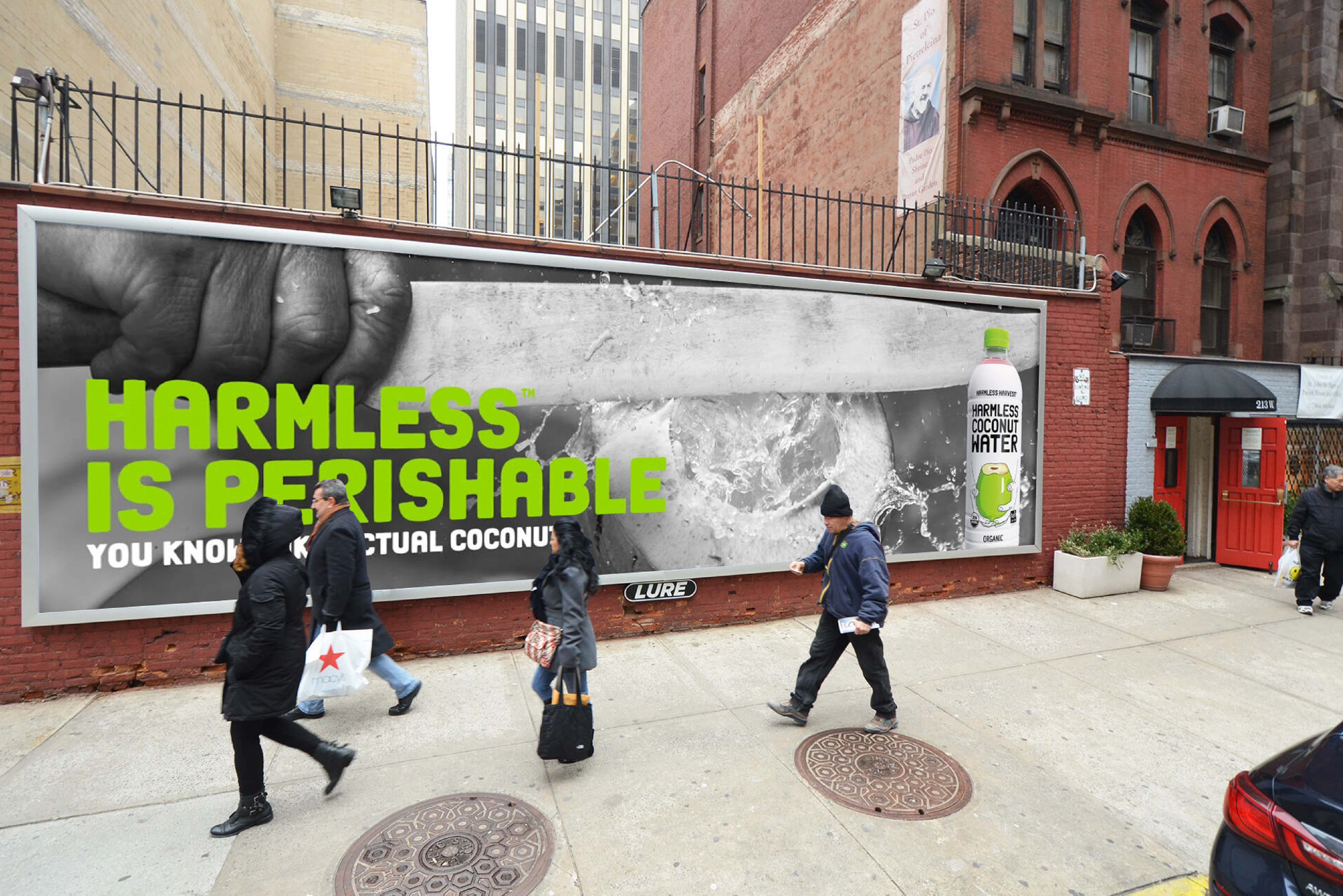
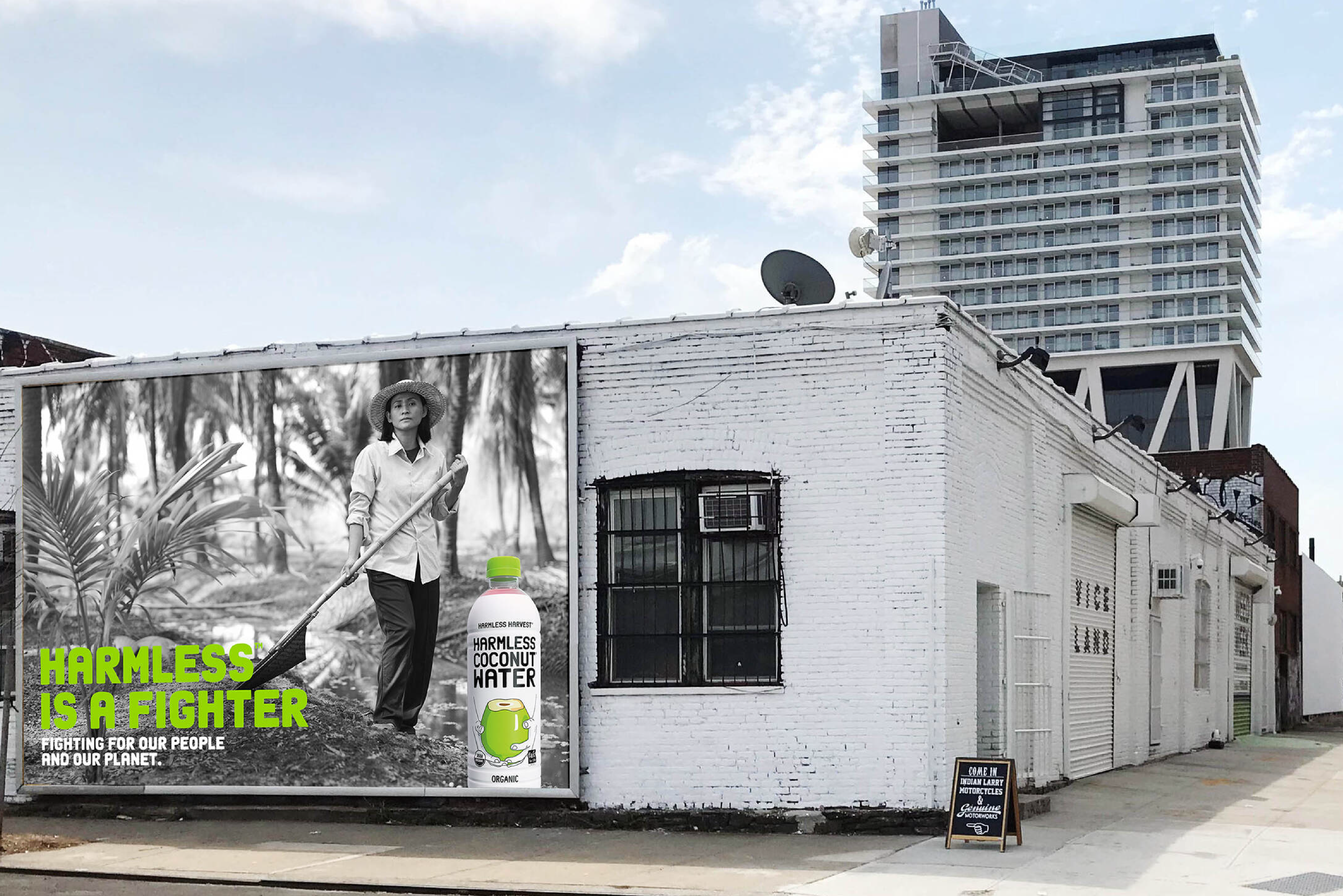

Harmless Harvest – OOH Campaign, 2018
Launched Harmless Harvest first ever OOH campaign in New York and Los Angeles. We created a campaign that puts the real faces behind Harmless Harvest front and center, focusing on the farmers and workers in Thailand who supply the brand.
With Harmless Harvest’s strong commitment to fair trade, everyone in the supply chain is ensured a fair wage. We were given full access to immerse ourselves in the daily lives of these farmers, gathering inspiration directly from the source. This honest portrayal, paired with messaging that pushes against traditional brand values, provided a bold and authentic introduction to the heart of Harmless Harvest.
Design Agency: DCX
Creative Director: Tommy Noonan & Doug Cameron


BYTES Edibles — Brand Identity + Packaging + Illustration, 2025
I had the opportunity to help shape the visual identity for an upcoming edible brand launching in 2025 in Seattle, Washington. The founders set out to create a low-dose, plant-based gummy, thoughtfully crafted with a precise blend of cannabinoids and terpenes. The goal was to offer a product that delivers consistent, reliable effects, making it suitable for any time of day.
CGI Artist – Emmery Macsay
CGI Artist – Emmery Macsay


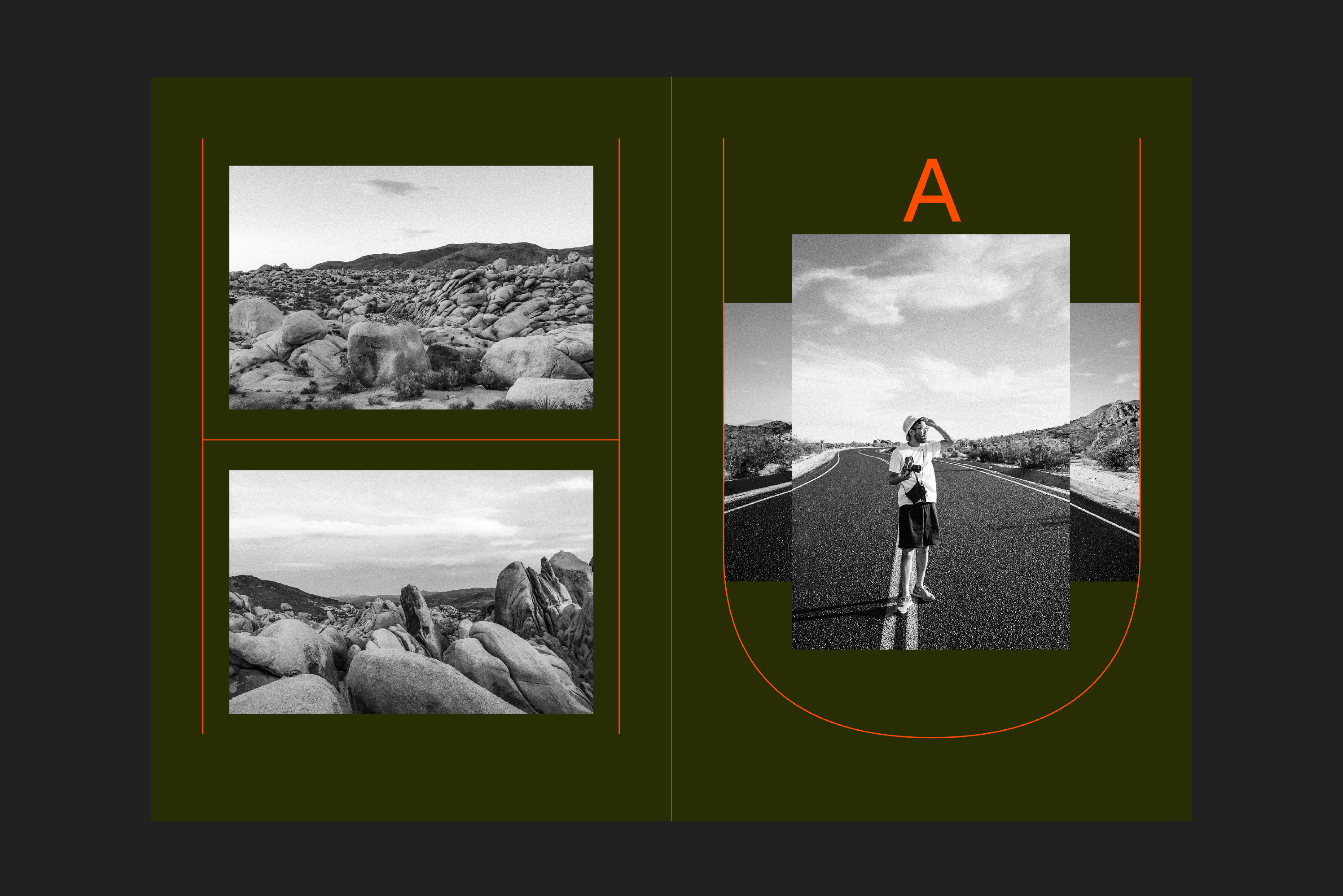
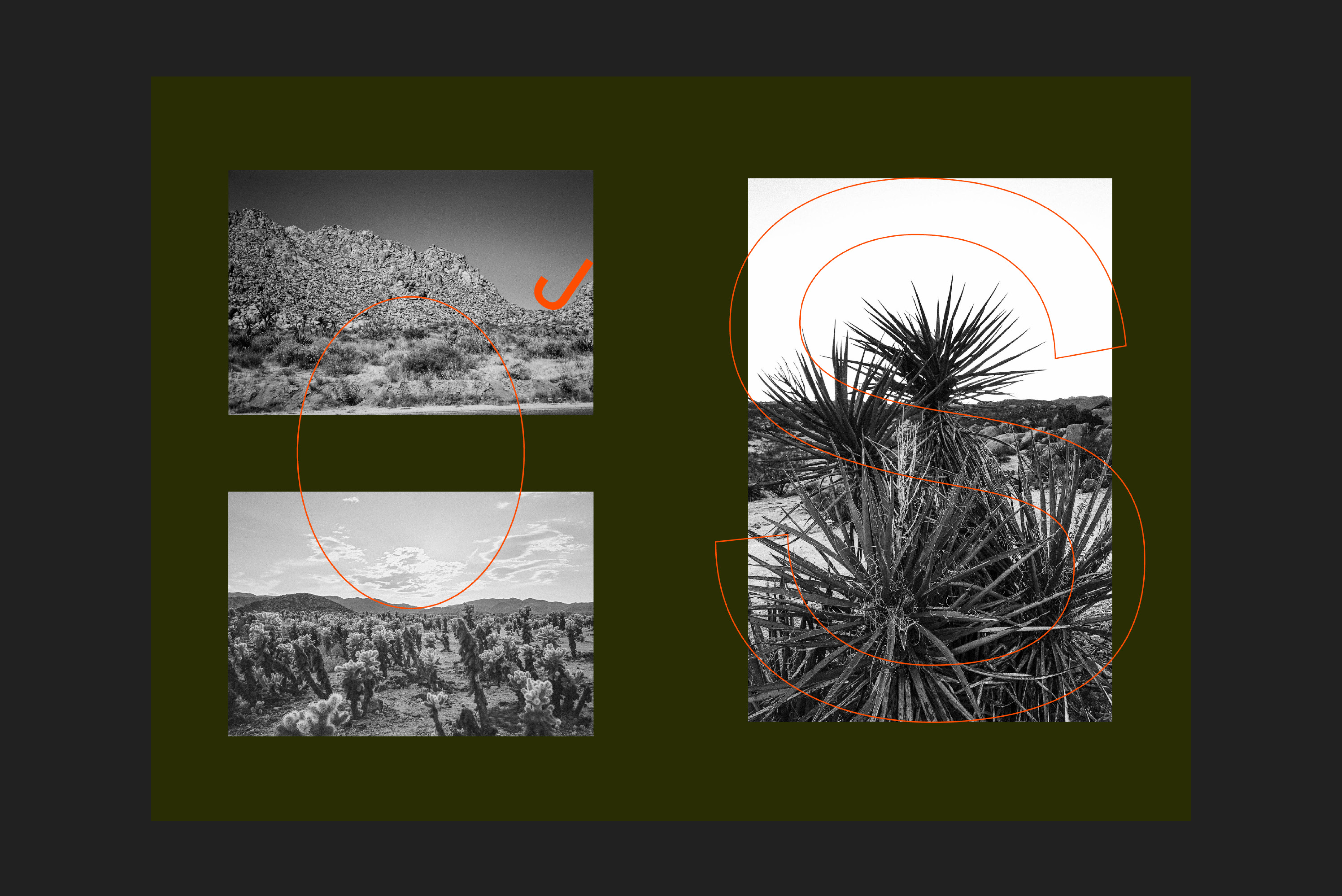
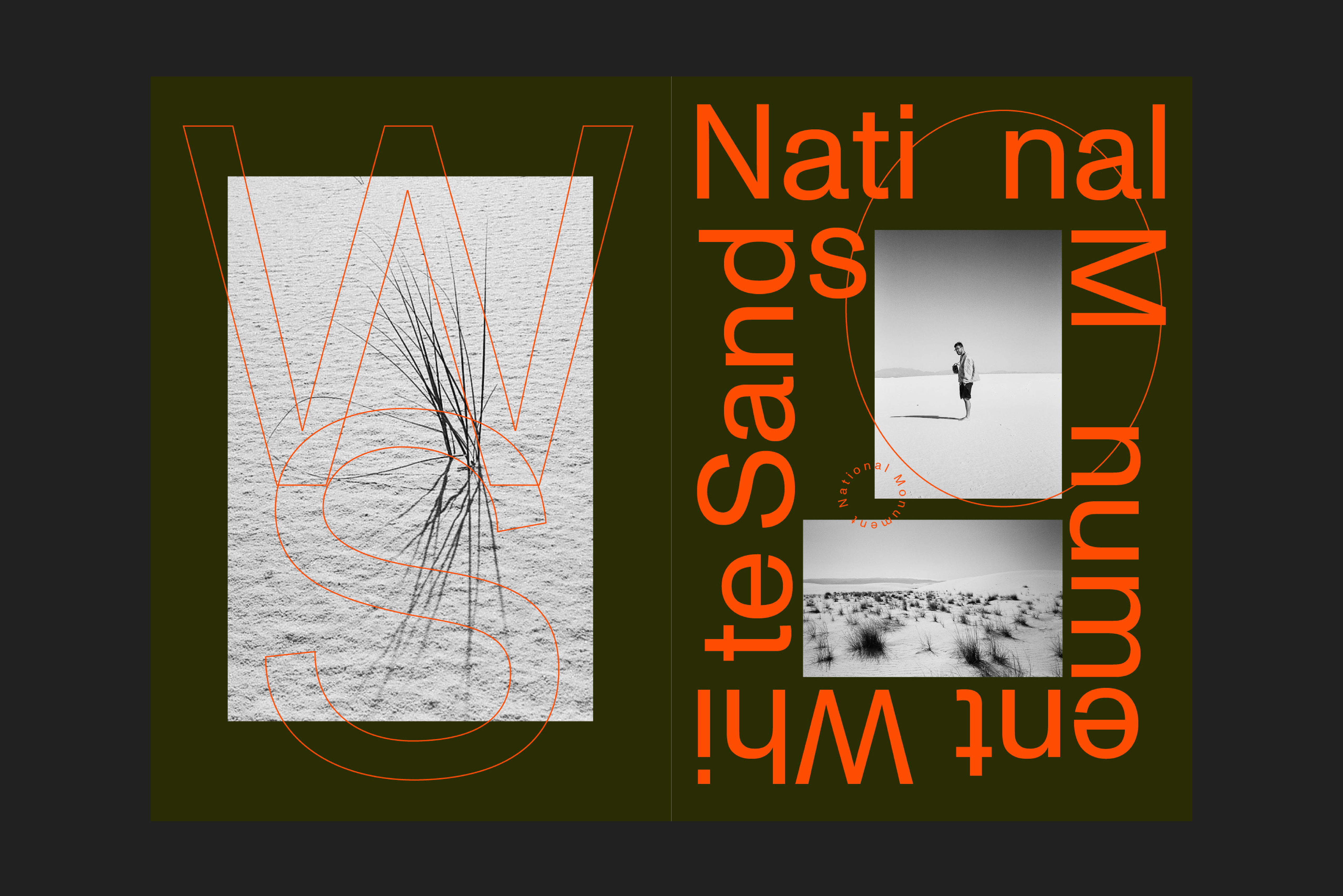
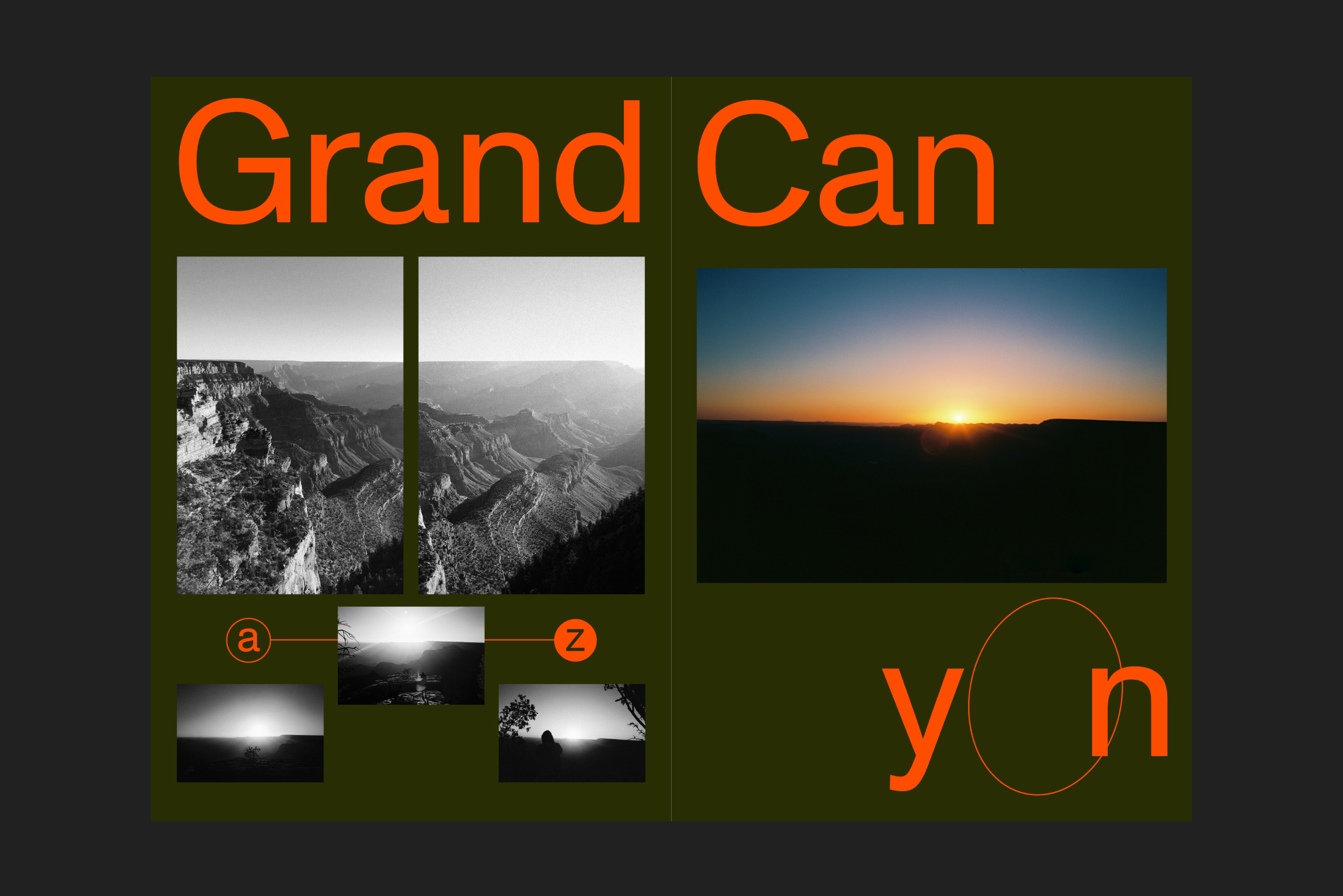
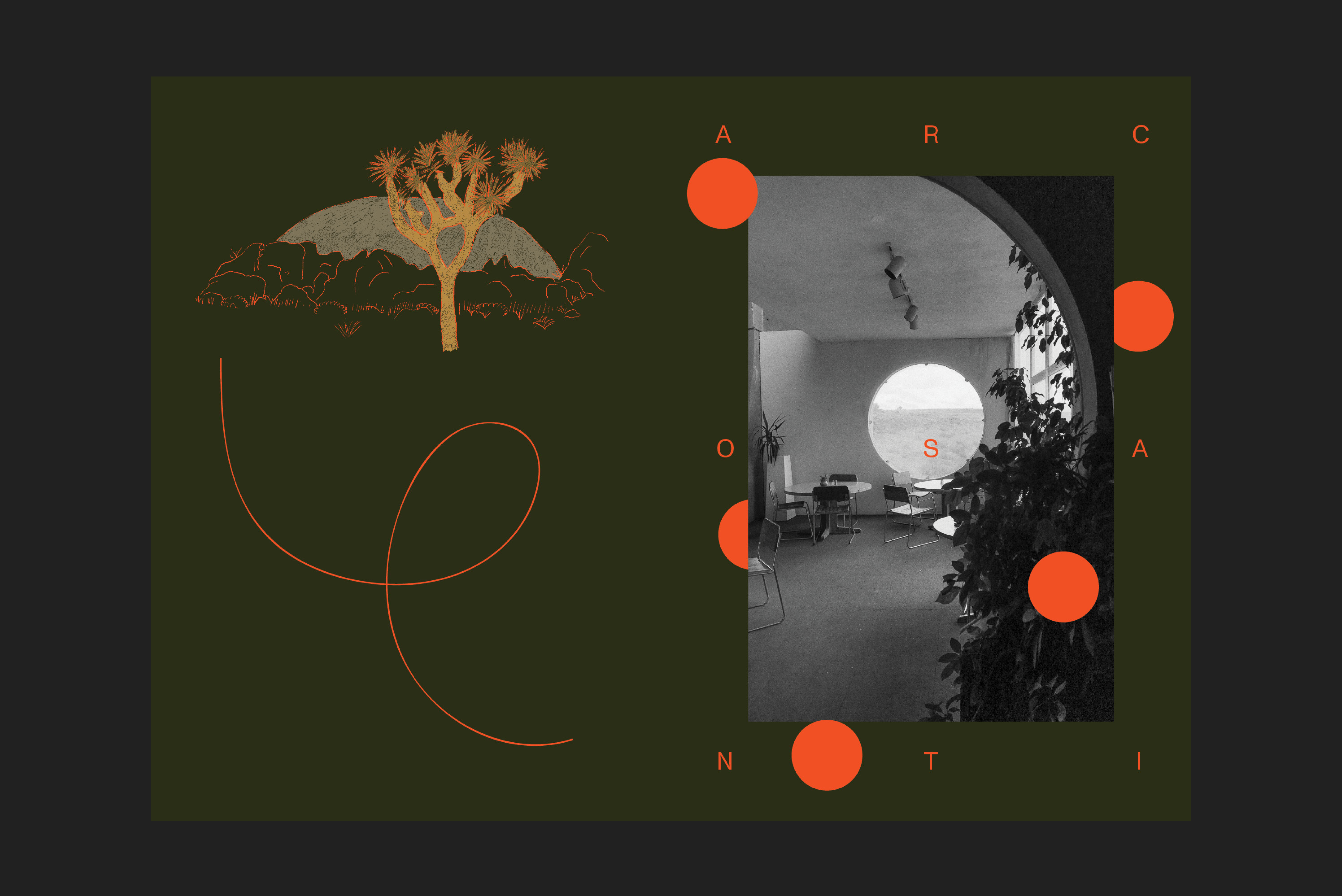
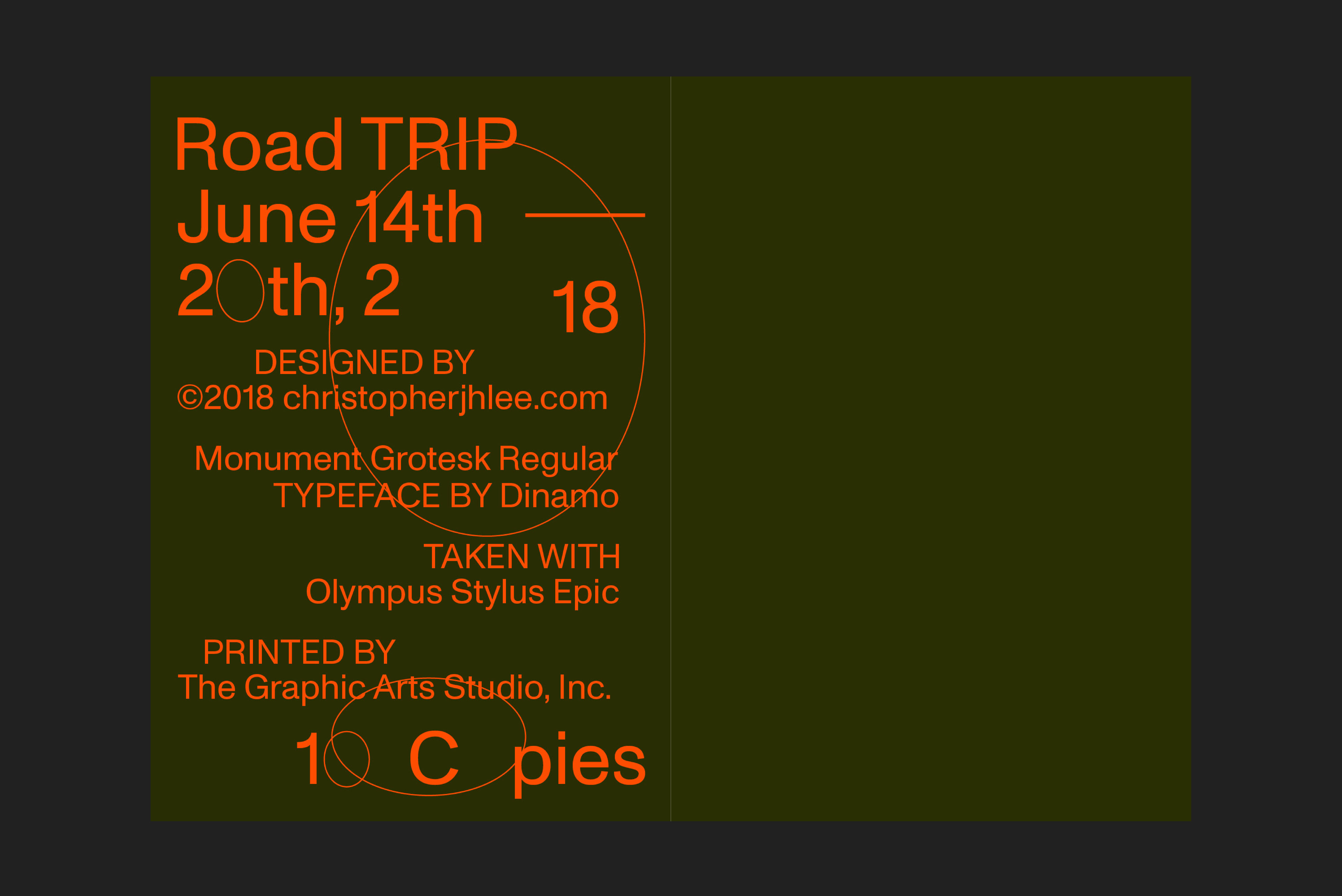
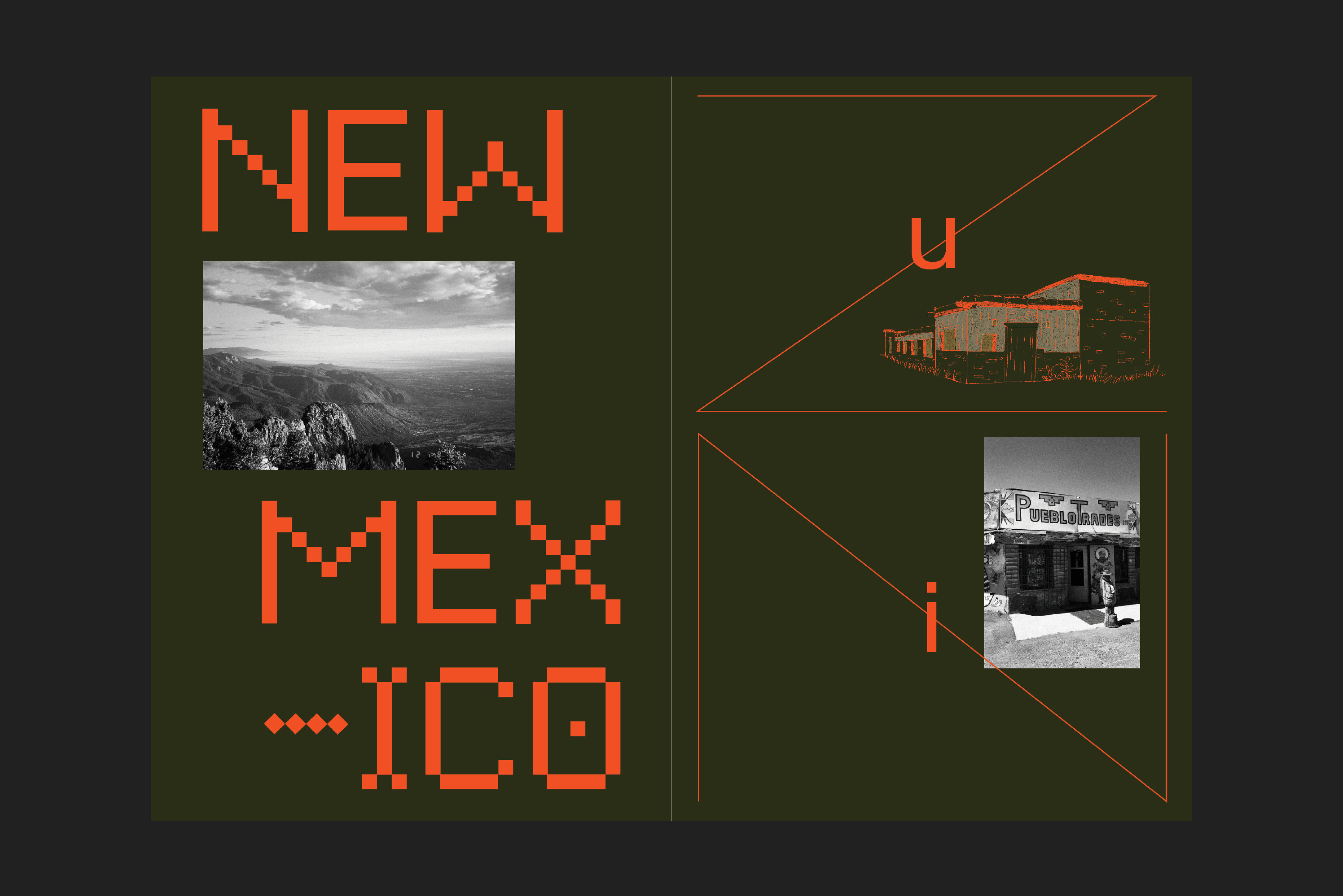
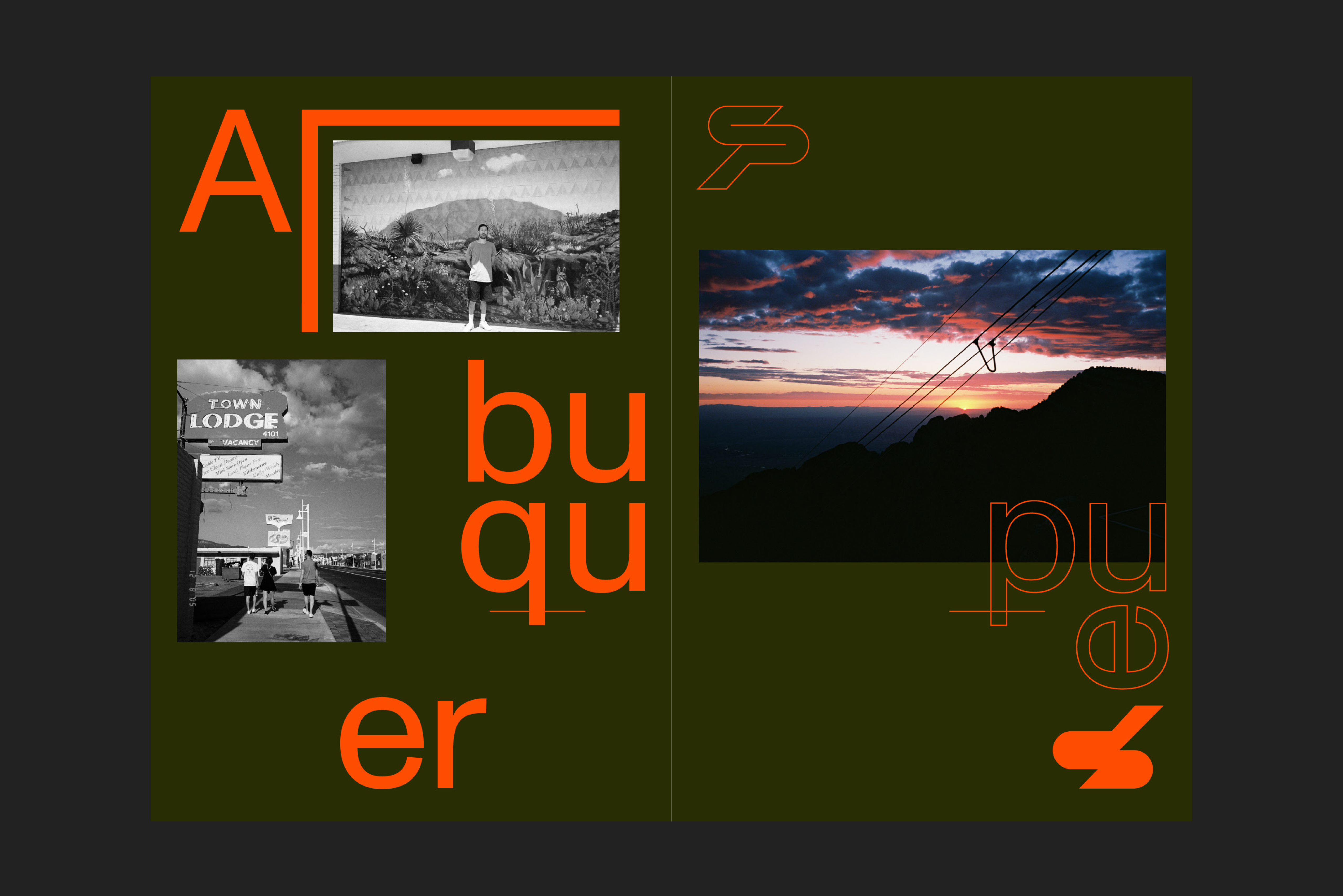
LA Zine — 148 x 210mm, 24 page, 2018
The 24-page zine includes photographs I’ve taken from a road trip with my friend Akira Nakamura in the summer of 2018.
A5, 24 pages, Loop Stitch, Typeface – Monument Grotesk, Camera – Olympus Stylus Ep, Grout Gray – 70 Construction Text, Printer – Graphic Art Studio
A5, 24 pages, Loop Stitch, Typeface – Monument Grotesk, Camera – Olympus Stylus Ep, Grout Gray – 70 Construction Text, Printer – Graphic Art Studio

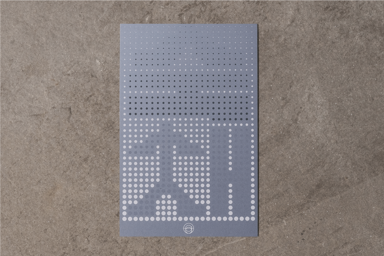
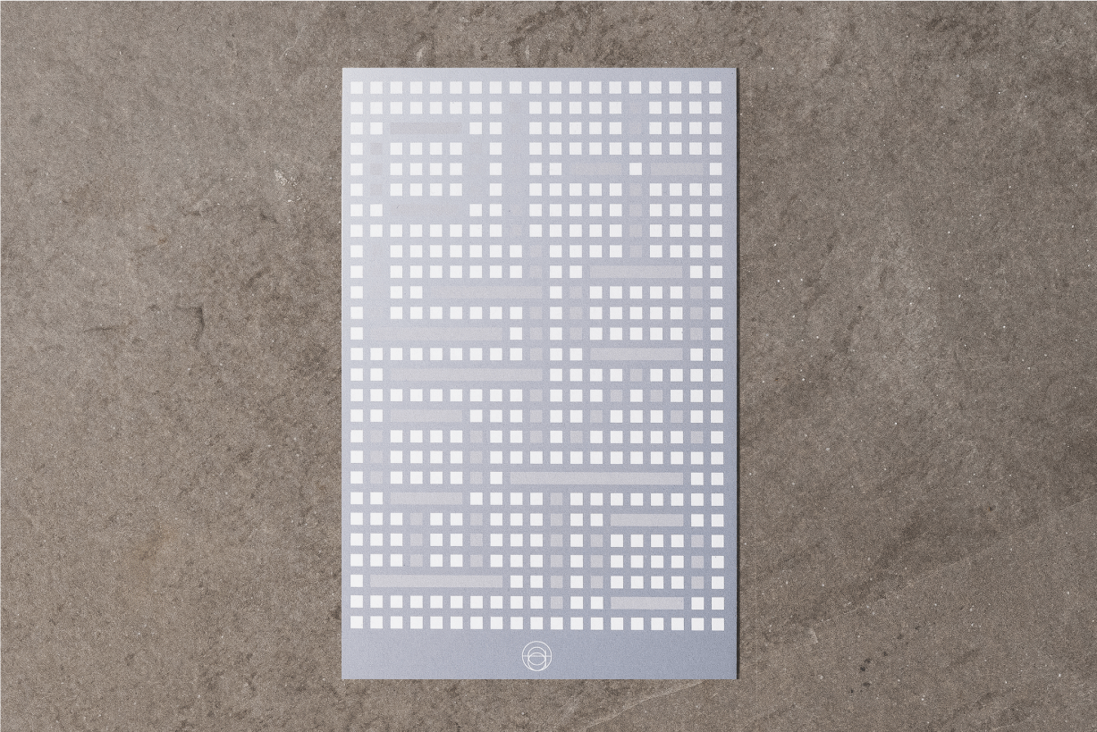

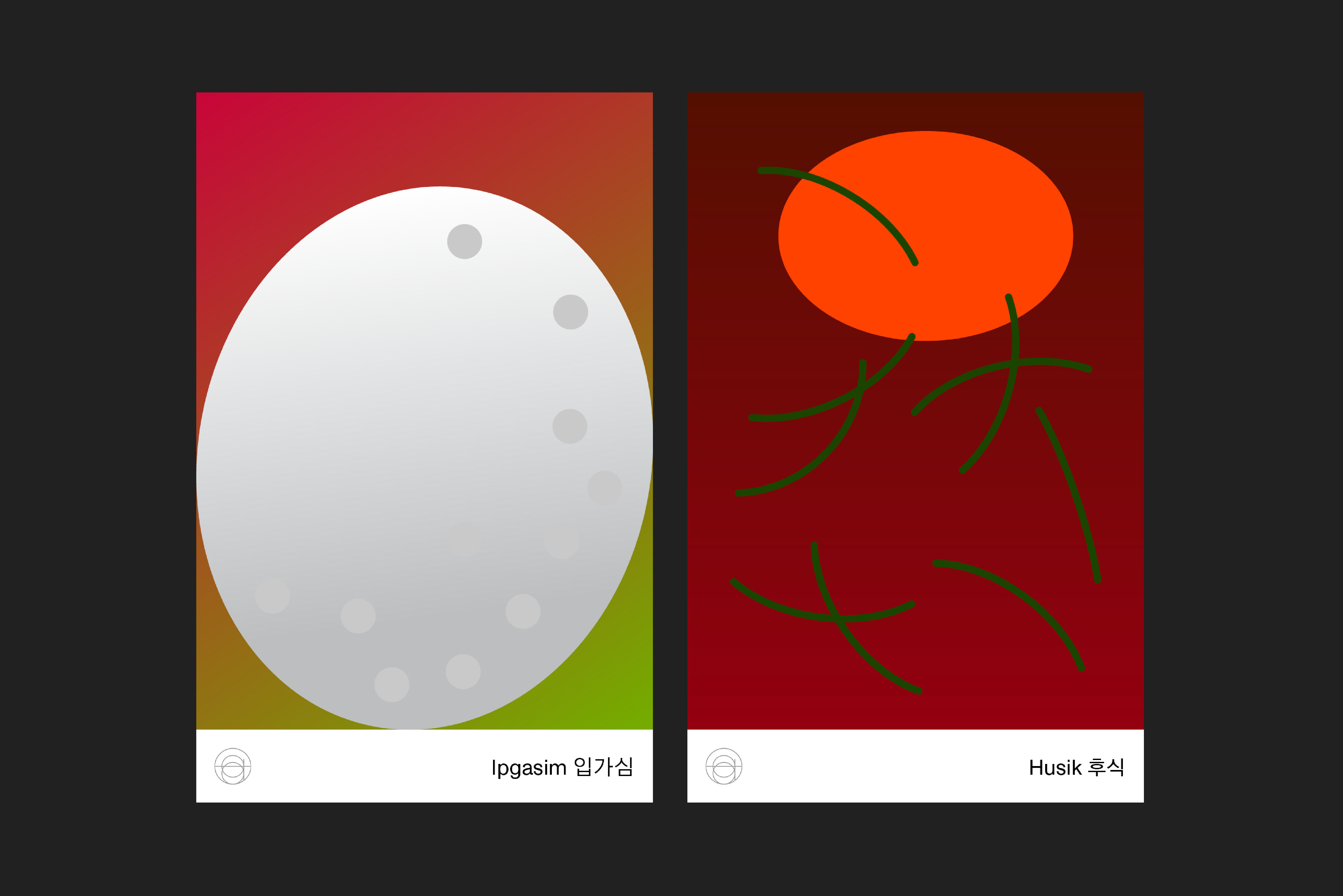
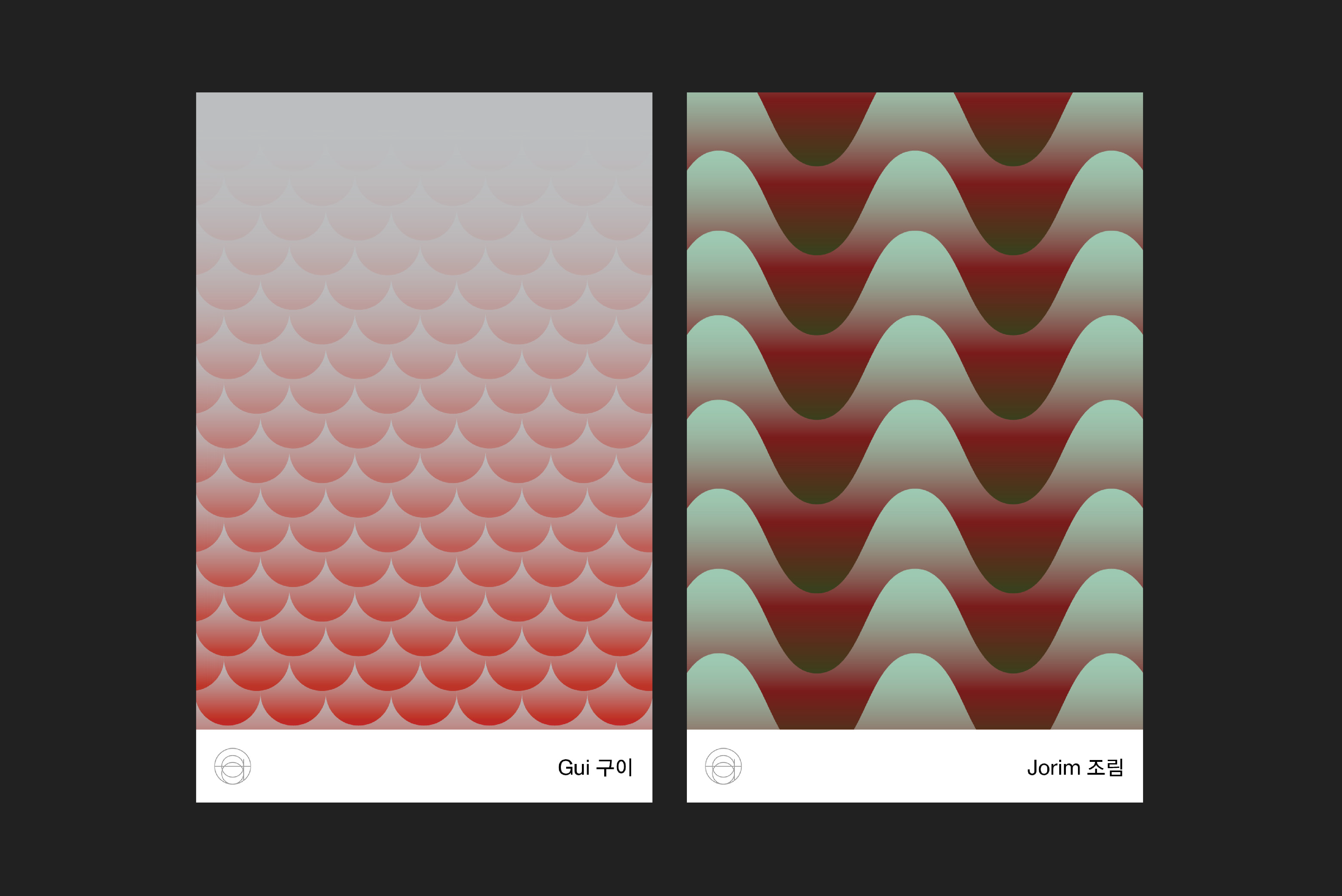
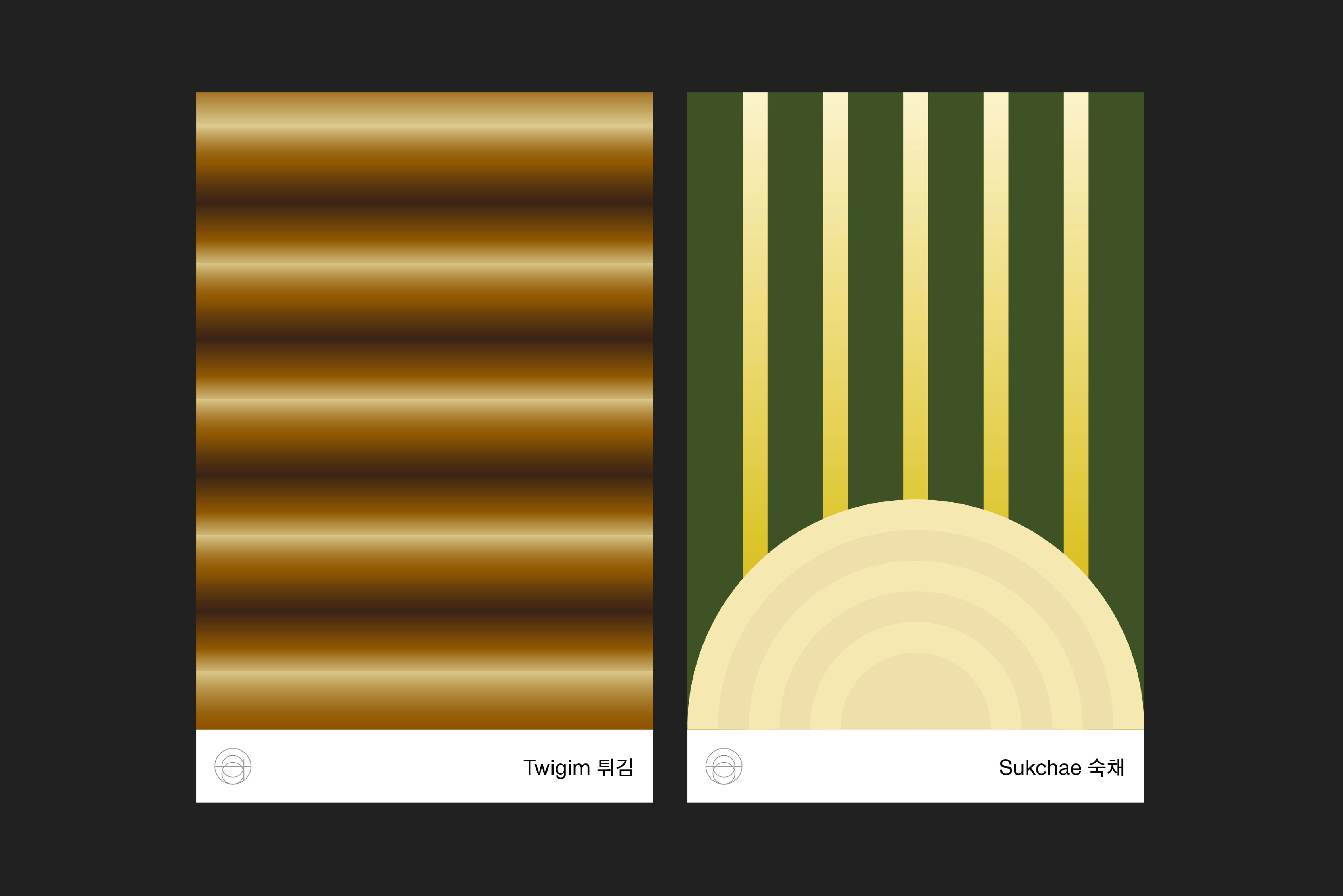
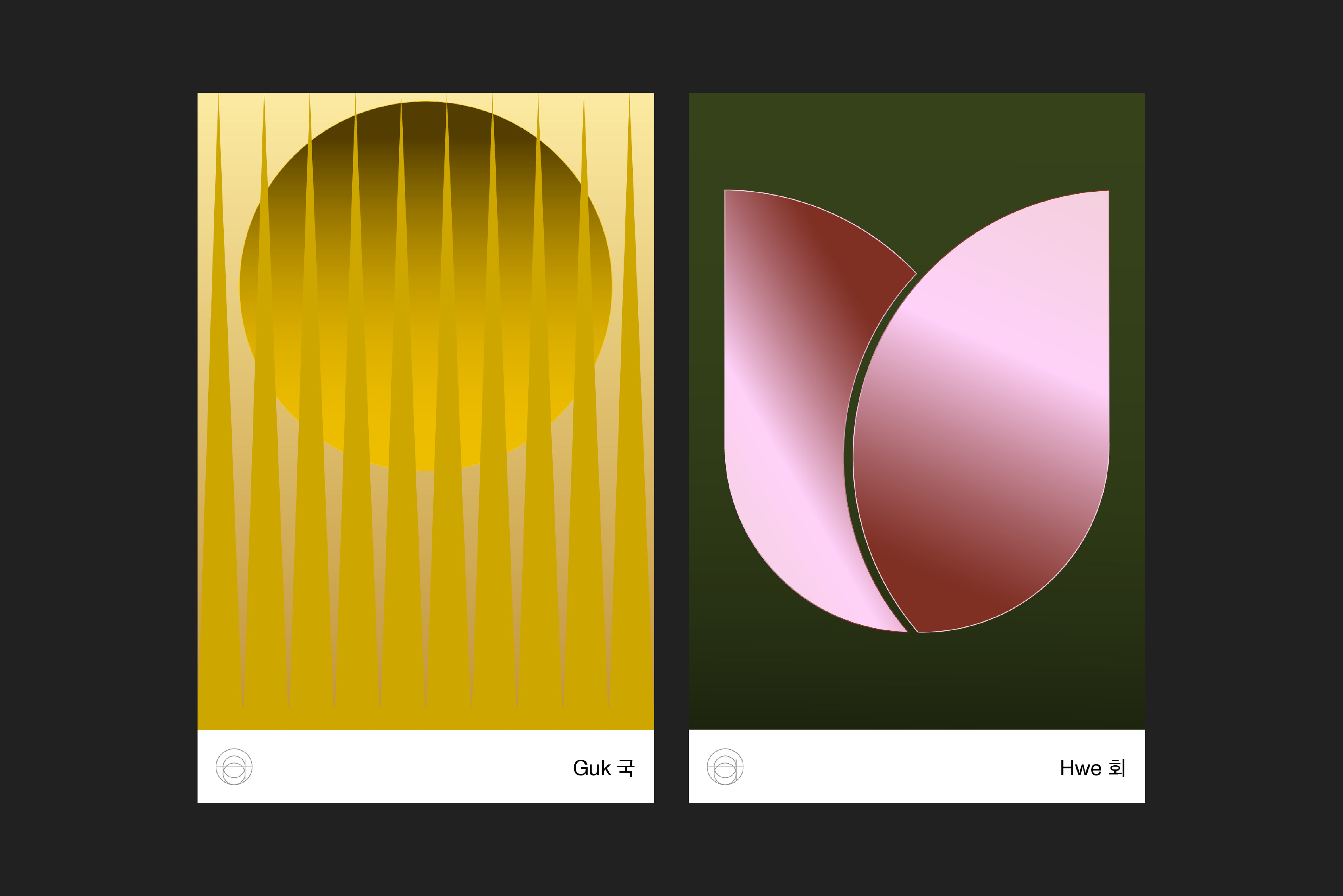
Atomix — Menu Card 90 x 140mm, 2020
For this season at Atomix, I wanted to emphasize on the beautiful Hangul letterforms to the guests by creating 10 unique type exploratins for each of the 10 dishes.
90 x 140mm, Typefaces, Monument Grotesk, Gothic A1, 100% recycled, 130, Printer, Smartpress
Photography by Diane Sooyeon Kang
︎ atomixnyc
90 x 140mm, Typefaces, Monument Grotesk, Gothic A1, 100% recycled, 130, Printer, Smartpress
Photography by Diane Sooyeon Kang
︎ atomixnyc
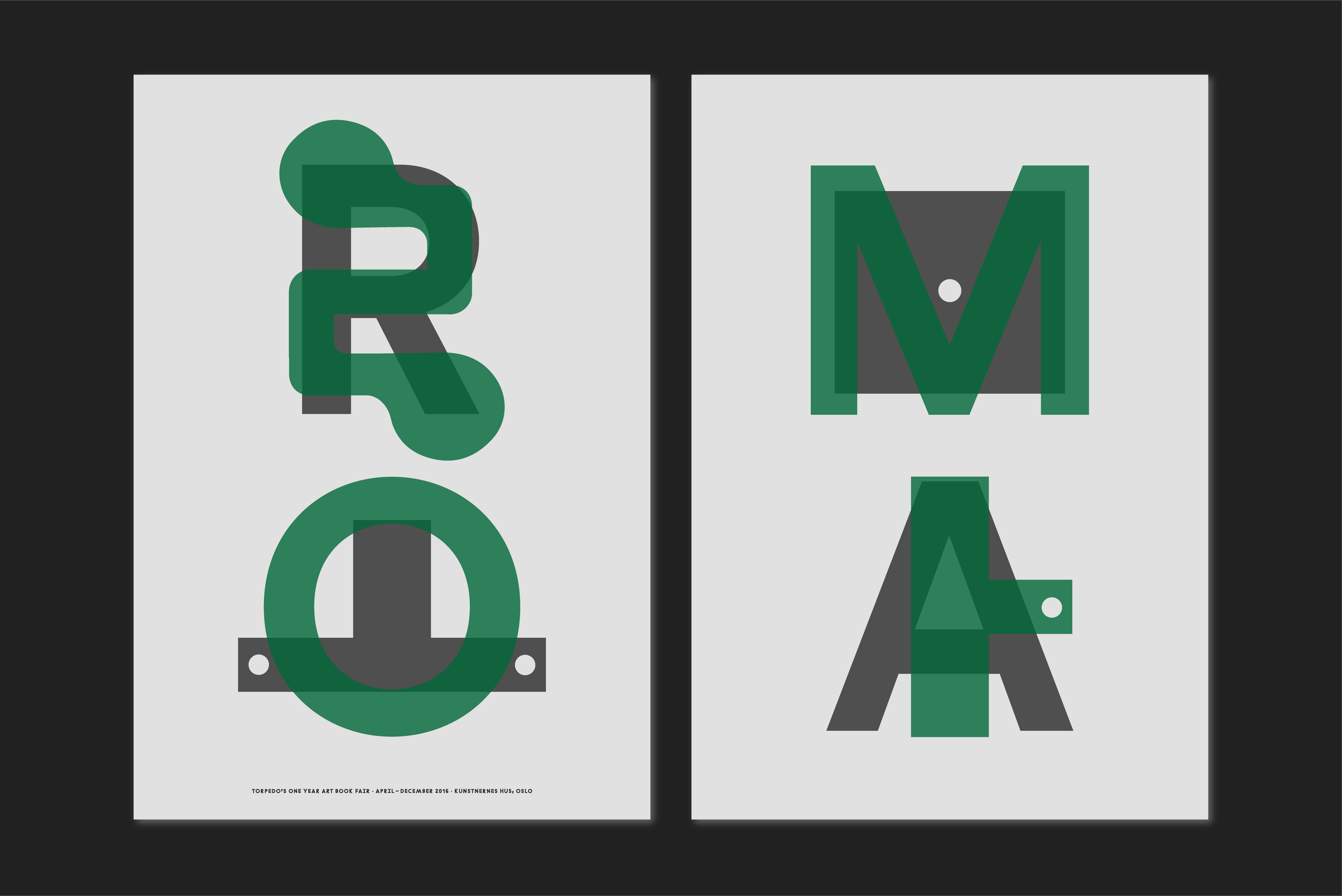
ROMA Poster — A2 Format (420 x 594mm)
Participated in the OYABF workshop hosted by Node in Oslo, Norway. The assignment was to select a book from Torpedo Bookshop's collection and design a poster representing the publication in any shape or form. I selected a catalogue published by Roma showcasing an exhibition that was held at MMCA in Seoul, Korea. The book was designed by Na Kim & Roger Willems. My idea was to translate RO(로) MA(마) using the same visual language as the illustrated cover by Karel Martens.
Posters were 16.5 x 23.4 in size and printed on an A2 Riso Duplicator. Total of 100 posters were printed and displayed at Atelier Felix and distributed all over the city of Oslo.
Posters were 16.5 x 23.4 in size and printed on an A2 Riso Duplicator. Total of 100 posters were printed and displayed at Atelier Felix and distributed all over the city of Oslo.